A severe local flood and social events show a similar impact on human mobility

Introduction
Being an innate need of human beings1, mobility represents one of the essential components of human societies and their economic activities2. Understanding the complex underlying mechanisms of human mobility is crucial for a wide range of applications, such as urban planning, traffic prediction, diseases spread, disaster evacuation and response3,4,5,6,7. The growth and proliferation of technological innovations, as Internet, mobile phones8,9,10, Wi-Fi, Global Positioning System (GPS), which led to an unprecedent availability of geo-referenced data on human mobility, enhanced our observations, assessments and modelling of human mobility dynamics5,11,12,13. In particular in the last decade, human mobility was primarily investigated through mobile phone data, i.e. the Call Detail Records (CDR) and Global Positioning System (GPS), the latter including geo-located social media5,7,13,14,15,16,17. The need to evaluate policies and interventions during the COVID-19 period, and likely the recent concerns about a possible increase of climatic hazards (related to a worldwide rapid urbanization and climate change), spurred further the usage of mobile phone data for human mobility studies13,18. Forecasts about climatic hazards (weather and climate extreme events) refer to a possible increase in both their probability of occurrence and impacts19,20,21,22, and can be justified by the sharp increase in the number of natural loss events — mostly climate-related disasters —, that occurred between the period from 1980 to 1999, and the following twenty years, i.e., from 2000 to 201923,24. A similar trend continued in 2020 and 2021, where climate and weather-related loss events and disasters represented the most frequent hazards (not considering the COVID-19 pandemics25), outstripping geological and technological disasters26. More recently, in 2022, floods and storms had the highest number of occurrences, causing the largest economic losses, and droughts affected the largest number of people27. Despite the abundance of studies that leveraged mobile phone data to analyse mobility patterns during disaster events, we still lack: (i) a universal framework for modelling the impacts of natural hazards related disasters, crossing geographical regions and different natural hazards related disaster events28,29, (ii) a full understanding of the complexity, dynamics, and interdependencies among social, economic and technical systems, which could be explored by integrating advanced techniques (e.g. AI)6 and different data sources, such as CDR, social media and satellite imagery, (iii) an effective and simplified transfer of mobility insights to policy-makers and stakeholders17,29, (iv) real-time tools to predict mobility patterns during real-world disasters, (v) a comprehensive analysis of long-term recovery and resilience patterns, (vi) a transparent procedure for data collection and elaboration13, and (vii) a clear comprehension of the fluctuations of human activities30. Instead of comparing different disaster events among each other28,29, in this work, we compare one natural loss event, i.e. a flood, with social events, both occurred in Switzerland, between June and July 2017. Indeed, we argue that possible similarities or differences among scheduled artificial events and unscheduled natural loss event would help us in better understanding the transition between the laws of ordinary and unperturbed mobility5,31 and the laws of perturbed mobility (e.g. that one proposed by Li et al. (2022)28). This will enhance our comprehension of the universal framework for modelling the impacts and complexities of natural hazards related disasters on human mobility, enabling future developments of effective climate change mitigation policies17. By using mobile phone data provided by a major telecommunications company of Switzerland (i.e. Swisscom, with a market share of around 60%, at the end of 201732), we show that a severe local flood, causing more than 90 million Swiss Francs of property damage33 (i.e. ~93 million USD, in July 2017), has an impact on human mobility similar to that one of major social events, as food festivals and concerts, both at a national and at a local scale.
Results
Similarities between social events and a local flood at a national scale
We consider the entire Swiss territory to describe the long-range impacts of medium-to-large social events (such as music and food festivals) and the impacts of a severe local flood, with a return period of 100 years, on human mobility (see Fig. 1). The investigated social events took place between the 17th of June and the 30th of July 2017, i.e. in a time window of 44 days. The flood, instead, occurred on Saturday the 8th of July 2017, i.e. exactly in the middle of the temporal window under investigation (see Supplementary Text (A German-to-English translation of notes about the flood) and Supplementary Table 1 for details on the flood and social events, respectively). Both types of events occurred within a geographical region that measures around 20 km times 15 km, and that crosses three Swiss cantons, named, Solothurn, Aargau, and Lucerne. Throughout the entire manuscript, we will call that region as the local area of study (see Fig. 1a), to distinguish it from the national area of study, the latter corresponding to the entire Switzerland (see Fig. 1b). To capture potential differences of mobility among the diverse types of events, we could simply focus, for each event, on the exact days and hours in which a specific event occurred, and then measure the corresponding impacts on mobility. However, the examined events occurred both during weekends (most of them) and weekdays, i.e. during days that are usually characterised by different mobility patterns. Indeed, for example, people go to work and to school during weekdays, while they are generally more involved in leisure activities during the weekends. In addition, the studied events lasted for different lengths of time, making the assessment of their impacts on mobility more challenging. One possibility to overcome potential biases could be to analyse the six weeks, composing the 44-day period, each week lasting from Monday to Sunday, both days included. This approach would require an observation period that is multiple of 7 (days), such as a 42-day period. We therefore neglect the first two days, a Saturday and a Sunday, of the examined temporal window of 44 days. For each of the six weeks, we then build two relative frequency distributions, displayed through histograms (12 histograms in total). One related to the number of visits (see Fig. 2a, and “Methods” (Datasets) for details), and a second one related to the distances travelled by those individuals who visited the local area of study, during the 42 days (see Fig. 2b, and “Methods” (Datasets) for details). Interestingly, the paths in Fig. 1b show that, during the entire period of 42 days, people arrived to the local area of study from the same or nearly the same regions of Switzerland. The number of visits and the distances travelled by visitors are common metrics for characterizing human mobility patterns5,17,34, underpinning various mobility models31,35,36,37,38,39,40,41. Those metrics were used to assess the impacts of floods as well42,43,44,45,46. For example, Podesta et al.42 and Coleman et al.43 used the counts of visit to specific points-of-interests, respectively, to quantify the community resilience and the lifestyle recovery, during and after a flood. Then, we compare the 6 distributions of visits — among themselves — pairwise (see Fig. 2a) and, lastly, we compare the 6 distributions of distances travelled, still pairwise (see Fig. 2b). Such comparisons represent, at a national scale, our idea of assessment of the impacts of both social and flood events, on human mobility. Indeed, in one of the examined weeks, we would anticipate a considerable perturbation of mobility, either in the number of visits or in the distances travelled by visitors, if the event responsible for such a perturbation were impactful enough. For example, we might expect a strong perturbation of mobility due to a severe flood, as that one occurring at the end of the 3rd week. To measure such differences among weeks, both for the distributions related to the visits and the distributions related to the distances, we use a set of common statistical tests and measures of distributional dissimilarity. About the distributions of visits, the two-sample Kolmogorov-Smirnov (KS) test and the two-sample Anderson-Darling (AD)47 test show that the null hypothesis is rejected at the 5% significance level, for each pair of estimated probability distributions Pi and Pj at different weeks, i.e. at i−week and j−week (see Supplementary Table 2). These findings suggest that the 6 distributions containing the counts of visits (to the local area of study) are not identical (Supplementary Table 3 shows variations in both the variance and the median). The pairwise comparison among the 6 distributions representing the distances travelled by visitors (to the local area of study), instead, shows no statistically significant evidence in favour of the alternative hypothesis (see Supplementary Tables 2 and 3). While the distributions of visits vary across weeks, the magnitude of the distributional differences appears comparable. Indeed, the values returned by the Jensen-Shannon divergence48,49, the Wasserstein distance, W150,51, the Hellinger distance52,53, the total variation distance52,54, the 1 − Szekely’s distance correlation55 and the 1 − Cosine similarity56 (please see Supplementary Text (Measures of dissimilarity among distributions) for details), are similar for each pair of distributions of visits (see Fig. 2c, and Methods (Dissimilarity matrix) for details). Likewise, for the pairs of distributions of travelled distances (see Fig. 2d). In addition, both graphics in Fig. 2c and d show very small values for all the above-mentioned metrics. The values related to the comparison among distributions at different weeks, and indicating the number of visits (see Fig. 2c), vary from 0 to 0.33, while the values related to the distributions representing distances covered by visitors at different weeks, vary from 0 to 0.1. Values equal to 0 would indicate identical distributions, while values equal to 1 would represent completely dissimilar distributions. If we group, from one side, all the values of the dissimilarity metrics related to the pairwise comparisons among the flood and the social events, and on the other side, all the values related to the pairwise comparisons among the social events, we notice that those values exhibit a similar degree of variation between the two groups. This is shown in the insets of Fig. 2c, d, respectively, for the distributions of visits and the distributions of distances. This implies that, at a national scale, the impact of the flood and of social events on human mobility — in terms of number of visits and distances travelled by visitors — is comparable. This feature of human mobility that we observe at a weekly time scale may persist at a daily level (see Supplementary Fig. 1), despite differences in events duration and sample sizes. We can indeed observe the insets of Supplementary Fig. 1c and d, where the values indicating the dissimilarity among distributions vary less among the flood-social pairs than among the social-social pairs, for both distributions of visits and distances. However, the reduced sample size at the daily level (resulting from a shift from weekly to daily analysis) could impact the reliability of certain dissimilarity measures, like the Wasserstein distance50, and the total variation distance57 (the Jensen-Shannon divergence, the Hellinger distance, the distance correlations, and the cosine similarity, appear instead less sensitive to sample size variations58,59,60,61). To confirm the pattern at a daily time scale, future research needs to address the limitations of small samples, varying event durations, and potential differences in mobility patterns between weekdays and weekends.

a Local scale map. b National scale maps.
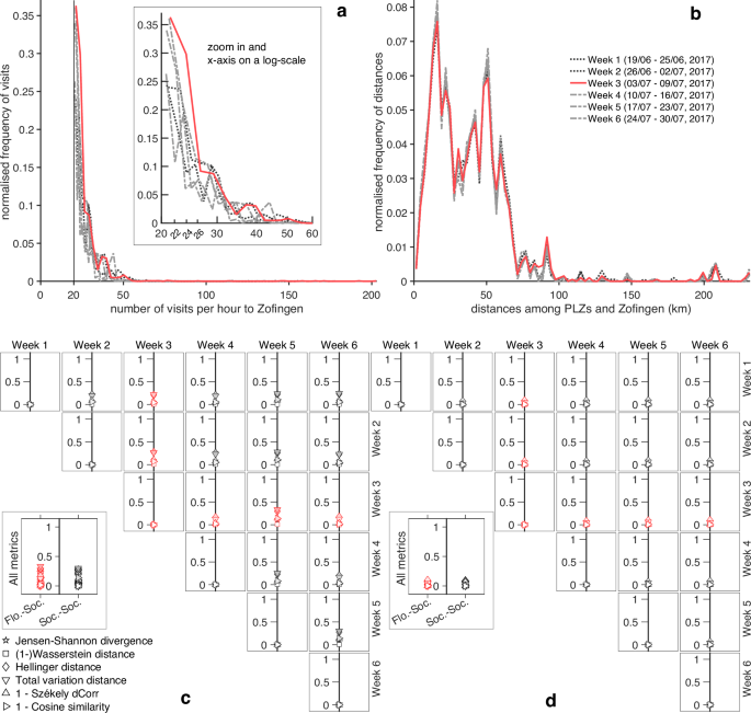
a Relative frequency histograms representing the empirical distributions of visits to the local area of study, during 6 weeks. b Relative frequency histograms representing the empirical distributions of distances travelled by people who visited the local area of study, during 6 weeks. c Comparison of the 6 histograms that represent the number of visits in each week. d Comparison of the 6 histograms that represent the distances covered by visitors, in each week. In the whole Figure, the lines and markers in red represent the week during which the flooding event occurred.
Similarities between social events and a local flood at a local scale
We now focus on the number of people who travelled each road or railway lines every hour, during the entire period of 44 days, and within the local area of study (please see Methods (Datasets) for details). Those intra-town or intra-city travels typically follow the daily circadian rhythm62, leading to regular variation of the number of travellers on each road and railway track. When a disruptive event — like a social or natural (loss) event — occurs, those variations might become irregular for a while, returning to the unperturbed state afterwards. If we consider the temporal evolution of the number of travellers as a “time series”, and the irregular variations of the number of travellers as “anomalies”, then, a disruptive event would cause anomalies in a time series. We therefore use the anomalies discovered in travellers-related time series to measure the impact of social and flood events on human mobility, at a local scale. Clearly, an anomaly can represent either an excess of travellers (e.g. overflow of traffic) or a dearth of people (e.g. empty roads due to road closures or disruptions), but in this manuscript we do not deal with the two types of anomalies separately, i.e. we do not specify if an anomaly is related to a surplus or to a lack of travellers. Indeed, we are interested in the overall patterns of anomalies, without a distinction between the different types of anomalies. Among the most relevant events that we found within the local area of study and throughout the 44 days, seven of them are distinct social events, named Aargau Cantonal Shooting Festival (ACSF), Bio Marché, New Orleans Meets in Zofingen (NOMZ), Tattoo concert & Children Festival, Ski Festival, Beach Festival and Summer Party, and only one of the largest events is a distinct natural event, i.e. the flood of the 8th of June. With “distinct events” we mean events that occured singularly, without any temporal overlap with other significant events. A few of the most significant events were instead “multiple events”, i.e. different major events that occurred at the same time, or with some temporal overlap (details about all the social events are contained in the Supplementary Table 1). Among the distinct social events, ACSF is the only one that occured in 7 different municipalities. This means that the corresponding attendees did spread out over 7 municipalities, instead of gathering in one municipality as in the other distinct social events. Therefore, due to the large dispersion of its attendees, we do not consider ACSF in the comparison among major events, throughout this work. For both distinct and multiple events, we detect anomalies with the Discord Aware Matrix Profile (DAMP) algorithm63, a numerical approach based on the well-recognised concepts of “discord” — that defines the notion of anomaly — , and “matrix profile” — a structure for data storage. DAMP requires some training data and the period of our times series, called subsequence length, which is calculated automatically by the algorithm (please see Methods (Discord Aware Matrix Profile (DAMP) algorithm) for details). We set a training period equal to 6 days, i.e. from Saturday 17th of June to Thursday 22nd of June 2017, both included. This means that the anomalies start to be detected by DAMP just after the midnight between the 22nd of July and the 23rd of July 2017. In addition, for each road or railway track, DAMP seeks for the largest anomalies, up to 10, if present.
We observe that the largest amount of anomalies is detected both during the course of all the major recorded events, and on Sundays in which no significant event was reported (please see Fig. 3a). Since the majority of the most significant recorded events took place over the weekends (among them, only NOMZ and the Tattoo Concert took place on weekdays), we can therefore say that the anomalies are concentrated around weekends, rather than on weekdays. Please note that this statement would be still valid even including a build-up of anomalies occurring on Tuesday 25th of July, which origin is unknown to us (and that we did not mention so far). Interestingly, we note that all Sundays are characterized by a peak of anomalies in the morning, at 8 a.m. At least partially, the peaks on Sunday 25th of June and on Sunday 2nd of July are due to, respectively, Bio Marché in Zofingen, and the School & City Festival in Olten (which started in the morning, around 7 a.m.). However, no relevant documented events took place on the other Sundays, early in the morning. We, therefore, associate those peaks of anomalies, that regularly happen at 8 a.m. every Sunday, to recurrent leisure activities, typical of weekends64,65,66. Hence, if every Sunday features regular leisure activities, regardless the occurrence of any event, when an event then takes place on Sunday, it would contribute to increase the peak of anomalies. This would be quite evident for the peak of anomalies observed on Sunday 25th of June at 8 in the morning, during Bio Marché. This observation would suggest that a relationship exists between the number of anomalies and the number of attendees, but it would be difficult to find an accurate one, since we just have rough estimates of the number of participants to the events (and not even for all the most significant events). Although those estimates are limited in accuracy, Supplementary Fig. 2 illustrates the number of attendees versus the number of anomalies (or against the local maxima of anomalies) per event, based on the available data. If we consider the largest local maxima in Fig. 3a we can notice that the height of the flood peak (8th of July) is very similar to the peaks’ height of both the Tattoo & Children Festival on Friday 7th of July (with ~1000 attendees) and of the Ski Festival on Saturday 15th of July (with ~1500 attendees). Also, the height of the flood peak (8th of July) is larger than the peaks’ height of both NOMZ (3rd of July) and Tattoo & Children Festival on Thursday 6th of July, and smaller than all the most prominent peaks’ height of Bio Marché (23rd-to-25th of June, with ~12,000 attendees per day), Beach Festival (22th of July, with ~5000 attendees), and of the multiple events that occurred the 1st of July (with ~6500 attendees). Therefore, such a visual comparison among the local maxima in Fig. 3a allow us to identify a similarity between the impact of social events, with an estimated number of attendees between ~1000 and ~1500 individuals, and the impact of a local flood, on human mobility.
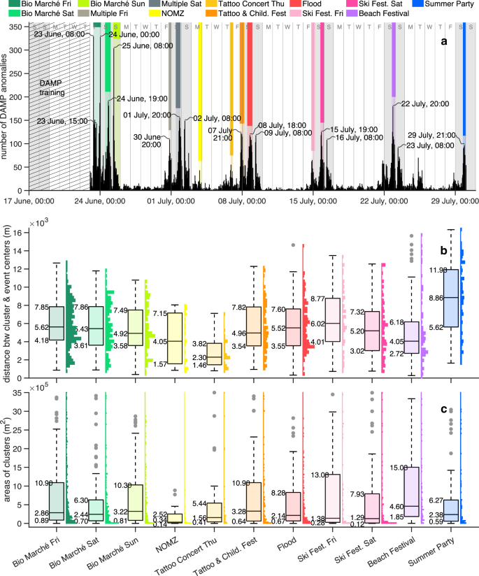
a Temporal evolution of anomalies over 44 days. The coloured bars are purely visual indicators, marking the duration of each event (without representing any physical quantity). b Distribution of distances among clusters of anomalies and an event centre, per each type of event. c Distribution of areas of clusters of anomalies, per each type of event.
Although the sole number of anomalies might give already an indication on the similarities between the social events and the flood, it does not convey any spatial information, except the name and border of the municipality where an event took place. As a first spatial information about the roads and railways’ anomalies, we observe — for example from the Supplementary Figs. 3 to 6 — that the anomalies are scattered all over the local area of study, with varying density, and showing different patterns every hour. Given such variations of density, we hypothesize that a sufficiently significant event would be responsible for the occurrence of anomalies mainly in the surroundings of the same event. In other words, we expect that anomalies group around the location where an event takes place (for example, please see in Supplementary Fig. 4, in the time range between 6 p.m. of Thursday 6th of July and 1 a.m. of Friday 7th of July, and in Supplementary Fig. 5, between 7 and 8 p.m. of Saturday 22nd) Since in data mining and machine learning the groups of data-points in (high-dimensional) data spaces are called “clusters” — which are detected with techniques of data clustering — 67, we define the collections of nodes that represent the groups of roads and railway tracks with anomalies as “clusters”. At the same time, roads and railways tracks represent the edges of the corresponding transport networks, and the word “community” could be used here to indicate a group of edges that are “densely connected” within the community and “sparsely connected” to the other communities68. This would be a common terminology in network science, where a group of nodes is called community if those nodes are more densely connected within the community than with the rest of the network68. But then, can we call those groups of roads or railway tracks with anomalies as communities, if densely connected? Still from Supplementary Figs. 3 to 6, we notice that some edges with anomalies are relatively far from the rest of the edges with anomalies, and they could be then considered as “outliers”. Indeed, those isolated anomalies could be caused by a single road disruption, or by a single technical issue on the railway line, and not related to any major event. Also, we can notice that relatively close edges with anomalies, might not have common nodes, but the corresponding anomalies could have been originated by the same event. The latter observation would mean that those edges with anomalies might belong to the same community (i.e. resulting from the same event), but being internally disconnected within it, i.e. a part of the community could be reached only through a path outside the community. Although there is no universally accepted definition of community in network science69,70, the connectedness among nodes is considered as a basic requirement to define a community69, and internally disconnected communities are generally deemed to be bad partitions of a network71,72. Therefore, we could use the noun community if we extend its definition70 to those ones that might be internally disconnected, or if we just consider definitions of community based on node similarity69. In this way, the terms “cluster” and “community” might be used interchangeably.
By following our observations on the detected anomalies positions, we use RNN-DBSCAN73 — a data clustering algorithm — as a density-based community detection technique74,75 (please see Methods (Reverse Nearest Neighbour Density-Based Spatial Clustering of Applications with Noise (RNN-DBSCAN) algorithm) for details). Indeed, RNN-DBSCAN can detect disconnected communities of arbitrary shapes and various densities, and filter noise, as those isolated edges with anomalies that would unlikely result from major events76,77. Once the clusters are detected, we can assess our hypothesis (that anomalies occur around the events) for every event, by measuring the distances between the clusters centres and the event centre. A cluster centre might be calculated by simply averaging the coordinates of the cluster’s data points. However, the resulting centre would be influenced by the number of data points, and would be driven towards denser areas of data points. Thus, we draw a tight 2-D boundary78 that surrounds the cluster’s data points, and we calculate the centroid, or centre of mass, of the resulting polygon79. A centroid is indeed less influenced by different densities of the cluster’s data points79. For each event, the resulting distribution of the distances among the clusters centres and the event centre is shown in Fig. 3b, while the distribution of the clusters areas (i.e. the polygon areas) is illustrated in Fig. 3c. Please note that some of the events in Fig. 3b, c took place over two or three days, and, therefore, the number of distributions is larger than the number of distinct events. Alongside the distributions we show the corresponding boxplots, which provide descriptive statistics and facilitate a visual comparison among (the distributions of) different events. Probably, the first thing that strikes the reader about the boxplots in Fig. 3b (related to the distributions of the distances) is that 7 out of 11 boxplots are remarkably similar to each other, i.e. those ones related to Bio Marché (all days), Tattoo concert & Children Festival (on Friday the 7th of July), the flood, and to the Ski Festival (both days). We used the expression “remarkably similar” since the boxplots look very similar to each other, despite the great difference in the estimated number of attendees who participated in those events. Indeed, ~12,000 people were estimated for each day of Bio Marché, ~1000 people for the Tattoo concert & Children Festival (on Friday the 7th of July) and ~2000 people for the Ski Festival. But, how could events of different magnitude (i.e. expressed through the number of attendees) lead to similar spatial dispersions of anomalies (i.e. similar boxplots)? We can exclude any reason related to the process of clustering the edges with anomalies through RNN-DBSCAN, since the boxplots in Fig. 3b are very similar to the boxplots in Supplementary Fig. 7 (related to the distributions of distances among the edges with anomalies and the event centres, i.e. before any usage of RNN-DBSCAN). We then suppose that the spatial dispersion of anomalies might depend on the network topology, since it is the same for all the events, rather than on the number of attendees. In particular, all the events with similar boxplots, took place in the same town (Zofingen), except the Ski Festival which was held in a town around 5 km far, in a beeline (Rothrist). In future studies, it would be interesting to quantify the influence of the network topology on the spatial dispersion of anomalies, for example, by employing topological and spatial measures of street and rails network structure80, such as the betweenness centrality. Indeed, we know that nodes with a large betweenness centrality exhibit non-trivial patterns, including the formation of “central loops”81. Moreover, the distribution of betweenness centrality is known to be an invariant quantity for most planar graphs, such as street networks82. This invariance was even observed during a significant flooding event in a mobility network (where nodes represent the origins and destinations of movements, while edges represent the trips undertaken between them)83. Given this, it would be valuable to explore how both the non-trivial patterns of betweenness centrality and the invariance of its distribution may play a role in the formation of anomalies.
Still comparing the boxplots in Fig. 3b we notice that the boxes representing the interquartile ranges of NOMZ and the beach festival, are slightly lower than the previous ones. However, we might still include those two events in the previous list of similar events (i.e. Bio Marché, Tattoo concert & Children Festival on Friday the 7th of July, flood, and Ski Festival). Indeed, if we use the “average median” calculated over the initially mentioned 7 boxplots, i.e. (leftlangle {Q}_{2}rightrangle approx 5.38) km, as one of the reference measures to uniquely characterize all the similar events, the medians related to NOMZ and the beach festival, i.e. (Q_{2} approx 4.05), can be still considered reasonably close to the average median. The boxplots related to the Tattoo concert (on Thursday the 6th of July) and to the Summer Party, instead, look quite dissimilar to the previously mentioned boxplots, and their medians, which are (Q_{2} approx 2.30) km and (Q_{2} approx 8.86) km, respectively, are farther from the average median, than the NOMZ and beach festival’s medians. About the dissimilarity of the boxplot related to the Summer Party, we notice that a large number of anomalies detected during that event are quite far from the site where that event took place. The large distances between the edges (or clusters) of anomalies and the event location is then reflected in the values of the boxplot which are larger than all the other boxplots values. The dissimilarity of the Summer Party’s boxplot might be due to the event size (~500 attendees) which was not sufficiently large for producing a considerable number of anomalies in the surroundings of the event, and at the same time, another event might have occurred, about which, however, we did not find any record. Overall, the boxplot associated to the Tattoo concert (on Thursday the 6th of July) is the “lowest” one in Fig. 3b, i.e. it has the smallest boxplot’s summary statistics (except the minimum) than the other boxplots. This case would support our hypothesis about the occurrence of anomalies mainly in the surroundings of an event. However, why aren’t the other boxplots closer to distance zero as the boxplot related to the Tattoo concert? Or, other way around, if we take the 7 similar boxplots as reference, why does the Tattoo concert’s boxplot is considerably lower than them? We know that the number of trips (i.e. trip frequency) is usually higher during weekdays than during weekends84,85,86,87 (with some exception88), and that weekday trips are generally shorter86,87,89,90 and more regular91,92,93,94,95,96 than weekend trips. Despite there is some discordant results on trips regularities90,97, we think that the relative stability and the short distances of weekday trips limit the occurrence of irregularities, i.e. the anomalies. Therefore, given a less occurrence of anomalies during the weekdays, when a significant weekdays event takes place, most of the anomalies would be originated by that event. This means that, generally, a weekdays event would be more distinguishable — i.e. showing a clear(er) grouping of anomalies around the event — than other events occurring during weekends. This is the case of the Tattoo concert (on Thursday the 6th of July), which is the only major event that took place on a weekday not belonging to “long weekends” (i.e. Fridays and Mondays). Here, we exclude Fridays and Mondays, since the Monday travel behaviour might be similar to the weekend one93, and the patterns of activity-travel behaviour on Fridays could be dissimilar to the behaviour of other weekdays95,98,99. Now, if an event that takes place on weekdays shows clearer patterns of anomalies around and close to the event due to the stability of weekdays trips, once an event occurs during the weekend or in the run-up to the weekend (or either side of the weekend), the clusters of anomalies originated by the major event might be partially overlapping or mixed with the clusters of anomalies caused by irregular and long-distance trips, not necessarily related to the event. Therefore, the spatial distribution of the (clusters of) anomalies would include the irregular travel behaviour, occurring potentially anywhere. Consequently, once we show the spatial distribution of anomalies related to a major weekend event, this would be larger than the distribution of anomalies related to a weekday major event. However, despite a possible mix of anomalies resulting from major events and anomalies given by unpredictable weekend trips, in Supplementary Table 4 we notice that almost all the spatial distributions of anomalies’ distances (in Fig. 3b) show a general tendency to skew towards the event centres (i.e. positive skewness). This is another commonality between the flood and social events. Indeed, the Bowley’s coefficient of skewness (BS), and the Fisher-Pearson coefficient of skewness (FPS) in Supplementary Table 4 are positive for all the events, with the only exceptions of the Ski Festival on Saturday the 15th of July, where BS and FPS have discordant sign, and the Summer Party, where both BS and FPS are negative. Perhaps, such negative signs for both the BS and FPS might be interpreted as a lack of connection between the detected anomalies and the Summer Party. The reason why we use both BS and FPS is that, often, (strongly) skewed distributions have skewed boxes. Indeed, the Bowley’s coefficient assesses the skewness of the central box, while the Fisher-Pearson coefficient quantifies the skewness of the entire distribution. However, the skewness should generally refer to the entire distribution, which would bring our attention primarily to the Fisher-Pearson coefficient (even though the Bowley’s skewness is preferable in presence of outliers100). As possible qualitative descriptions, some authors101,102 suggest that distributions need to have a (leftvert ,text{FPS},rightvert ge 1) to be considered significantly skewed. Therefore, we can say that only the Tattoo concert (on Thursday the 6th of July) and the Beach Festival are fairly skewed (with FPS (approx 0.97) and FPS (approx 1.25) respectively), while the flood and the Ski Festival on Saturday 15th of July are instead moderately skewed (with FPS (approx 0.54) and FPS (approx 0.56), respectively). All the other distributions show a light positive skewness, with 0.05 ≤ FPS ≤ 0.39 (excluding the Summer Party). However, values of FPS less than 0.5 are often associated to approximately symmetric distributions.
While the distributions of the distances exhibit a light-to-moderate departure from symmetry (or they are approximately symmetric), all the distributions of the clusters areas — including the flood-related one — show a very high positive skewness, with a large concentration of values below the median Fig. 3c (please see Supplementary Table 4 for the exact values of BS and FPS). This means that (at least) half of the detected clusters are small or very small, in comparison to the entire range of values included in the boxplots. If we look at the medians of all the events, we can see that the approximate average median and the largest one would be, respectively, (approx 0.21 , {rm{km}}^{2}) and (approx 0.33 , {rm{km}}^{2}), if we do not include the Beach Festival (otherwise they would be, respectively, 0.23 km2 and 0.46 km2). Indeed, although the difference between the second quartile (i.e. median) and the first quartile in the Beach Festival is similar to other events, the first quartile of the Beach festival is the largest one among all the events ((Q_{1} approx 0.18 , {rm{km}}^2)), and it is around double of the second largest first quartile, which belongs to the Bio Marché (on Friday 23th of June). Therefore, the clusters of anomalies in the lowest 25% of the Beach festival’s distribution, reach at least twice the size of clusters in the lowest 25% of other events’ distributions. In other words, the lowest 25% of the Beach festival’s distribution shows a larger range of cluster sizes than in the lowest 25% of other events’ distributions, where the clusters have instead a similar size among each other. Another feature that stands out in Fig. 3c — and that demans some attention — is the large quantity of boxplots outliers. Indeed, although some outliers are associated to proper and correct assessments of the polygon sizes, other ones might be related to overestimates of the polygon sizes, and should therefore be interpreted with caution. The latter case occurs when long network’s edges, i.e. railways or motorways, have anomalies, and they are included into polygonal shapes, i.e. the clusters of anomalies (from which we calculate the clusters areas). Basically, the long edges stretch the polygons towards themselves, leading to an increase of the polygon area.
Although the boxplots in Fig. 3b, c provide a synthetic summary of the distributions of the clusters distances and areas, they do not directly represent variance or other measures of data variability. If we compare a set of measures of dispersion (except the interquartile range that yields the largest excursion of values among all the measures of dispersion — see Supplementary Fig. 8), we can still fairly assert that 9 out of 11 events are approximately similar to each other, in terms of spatial variability of anomalies. About the variability of the clusters areas, limited variations occur across the different events (in particular the values provided by the Rousseeuw-Croux scale estimators, Sn and Qn). This might indicate a certain degree of similarity among the events, as between the flood and the social events. Interestingly enough, the Rousseeuw-Croux scale estimators yield dispersion values comparable to standard deviation and mean absolute deviation in Supplementary Fig. 8a, and provide some of the most robust values of dispersion in Supplementary Fig. 8b, making it a versatile tool for measuring both types of dispersion.
Empirical relationships among the clusters of anomalies
The distributions in Fig. 3b, c provide us a coarse-grained description of the events, since they include, respectively, all the distances and all the areas measured during the entire events, i.e. from the starting hour to the ending hour of the event. With this approach we therefore lose the details related to every single hour (in any event), that might be useful to identify possible relationships among distances, areas, and number of clusters. Indeed, for (every event and) every hour, we know the number of clusters detected by RNN-DBSCAN, as well as their distances from the event centre, and their areas. We can then extend our local scale-related analysis by using these hourly-based data as fine-grained information. If we consider for instance the distances between the event centre and the farthest and closest clusters, i.e. ({r}_{max }) and ({r}_{min }), respectively, we observe that ({r}_{max }) and (Delta r={r}_{max }-{r}_{min }) are connected by a linear relationship (please see Fig. 4a, b):
where a1 and b1 are listed in Supplementary Table 5, for each event. Although Equation (1) does not show a direct relationship between ({r}_{max }) and ({r}_{min }) (since we prefer to use Δr instead of ({r}_{min }), for reasons of clarity), we can always transform it into ({r}_{max }=left(frac{{a}_{1}}{{a}_{1}-1}right){r}_{min }-left(frac{{b}_{1}}{{a}_{1}-1}right)), but bearing in mind that it would be undefined for a1 = 1 (i.e. we can use it only when a1 ≠ 1). By consulting Supplementary Table 5, we notice that both slopes corresponding to NOMZ and the Beach Festival are (a_{1} approx 1). This means that — for both social gatherings and their entire duration — the closest cluster has a constant distance from the event centre, ({r}_{min }={b}_{1}) (see the red line in Fig. 4a). All the other slopes, instead, are smaller than the NOMZ and the Beach Festival’s ones, being 0.45 ⪅ a1 ⪅ 1 (here, we exclude that one related to the Summer Party, due to the low coefficient of determination in Equation (1), i.e. (R^{2} approx 0.37)). In this case, if we read from left to right the Fig. 4a and b, not just the farthest cluster goes farther, but the closest cluster gets closer to the event centre as well (see the blue line in Fig. 4a). In other words, the space occupied by all the clusters, and identified by Δr, increases radially towards both directions, i.e. inwards and outwards. And, this behaviour is common to the vast majority of the events here presented, flood included. Obviously, the upper bound for any cluster’s distance is given by the perimeter of the local area of study, while the lower bound is zero, and it is reached when the cluster centre overlaps the event centre (see the black line in Fig. 4a and b, i.e. any point on the ({r}_{max }=Delta r) line, also called the ({r}_{min }=0) line).
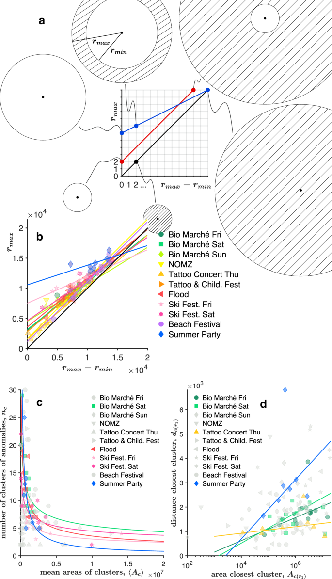
a Graphical explanation of the relationship between the largest and the smallest distances among clusters of anomalies and an event centre. b Largest distance between a cluster of anomalies and an event centre, against the difference between the largest and the smallest distances among clusters of anomalies and an event centre. c Number of clusters of anomalies versus the mean value of the areas of the clusters of anomalies. d Distance of the closest cluster of anomalies to an event centre against the area of the same cluster of anomalies.
About the number of clusters, nc, we observe that it decreases with the increase of the mean area of the clusters (averaged every hour), 〈Ac〉:
which might be somehow obvious. However, the way the number of clusters decreases might not be so trivial. We see that some events exhibit a power law, ({n}_{c}={a}_{2}{langle {A}_{c}rangle }^{{b}_{2}}), where the exponent ranges around (b_{2}approx – 0.3) (more precisely between −0.45 ⪅ b2 ⪅ −0.26) for those events that have a relatively high coefficient of determination (i.e. Bio Marché, on Saturday 24th of June, with (R^{2} approx 0.6), Flood with (R^{2} approx 0.65), and Ski Festival, both days, with (R^{2} approx 0.94) and (R^{2} approx 0.68), respectively). Still focusing on the areas of the clusters, we also observe a mild direct proportionality among the distance of the closest cluster, ({d}_{cleft({r}_{min }right)}), and its area, ({A}_{cleft({r}_{min }right)}):
In particular for Bio Marché (both Friday 23rd and Saturday 24th of June), the Tattoo & Children Festival (on Thursday 6th of July) and the Summer Party (on Saturday 29th of July), we can write a logarithmic relationship, i.e. ({d}_{c({r}_{min})}={a}_{3}log ({A}_{c({r}_{min})})+{b}_{3}), where the coefficients are shown in the Supplementary Table 5.
Anomalies in the framework of multi-layer transportation networks
A multi-layer network103,104 is a framework consisting of coupled networks that are connected (to each other) through inter-links, and it allows to approach the complex reality of interconnections and interdependencies among the diverse networks, typical of real-world systems. Although the literature on coupled multi-layer networks is extensive105,106,107,108,109,110,111,112,113, there is a scarce evidence about the usage of multi-layer approaches for investigating the impact of floods on transportation networks114,115. However, this framework was employed to model multimodal transportation116,117,118,119, where each mode of transportation (e.g. bus, tram, metro) was represented by a distinct network (layer). A typical analysis in multi-layer networks is related to their robustness, i.e. one investigates if the network functionality is preserved during random failures or targeted attacks (e.g. starting from nodes with highest degree or betweenness), up to the shattering of the coupled networks into small clusters. Once fragmented, a multi-layer network might still maintain a certain degree of functionality within the “mutually-connected components”, i.e. when there is an intra-layer path between two nodes in all of the intra-layer networks104,110. Here, we do not perform any analysis of robustness (i.e. percolation) among the coupled networks, but we just focus on the final stage of the process of networks fragmentation, i.e. on all the possible smallest mutually connected components, where the change of transport mode and the return to the initial starting place are guaranteed. As shown in Fig. 5a, in our case we have three layers, i.e. rails, urban roads, and motorways, and the mutually connected components are represented by the differently coloured “cycles”. In this framework, interlinks would be “functionally interdependent”120, and would start both at train stations (for the railway network) and at the motorways entrances or exits (for the motorways layer). What is surprising here is the presence of anomalies (detected with DAMP) in the smallest mutually connected components, and for all the events (see Fig. 5b). Indeed, the mutually connected components should be the smallest elements in networks where the functionality should be preserved. Although anomalies could represent both a congestion or a smaller amount of people, in case of congestion, the functionality would be compromised. Also, it is interesting to notice the similarity among the flood and other social events, in terms of mean number of anomalies, for both rail-urban roads cycles and motorways-urban roads cycles. Interestingly, all the events except the Tattoo & Children Festival (on Thursday 6th of July), have averagely more anomalies in the rails-urban roads cycles than in motorways-urban roads cycles. This might be interpreted as a larger impact of the events on the railway network, than on the motorways layer. This aspect would also make the flooding event look similar to the social events. The Tattoo & Children Festival (on Thursday 6th of July) is not just the only event that impacts slightly more the motorway network than the railway one, but it also exhibits the lowest amount of anomalies in both rails-urban roads cycles and motorways-urban roads cycles among all the events in this study. This feature means that the event has a fairly small effect on both motorways and railways. In this case, the multi-layer approach for assessing the robustness of coupled networks might not be necessary (since the amount of anomalies in both types of cycles is quite small), while the traditional measures of robustness for single layers (monoplex) might be more appropriate, or at least sufficient.
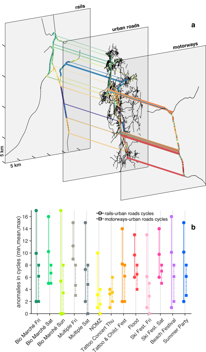
a Multi-layer network representing the local area of study. The network includes three layers: the urban roads layer, the motorways layer and the rails layer. The coloured edges represent the unique cycles of the multi-layer network. Please notice that a number of edges are multicoloured due to the overlap of some cycles. b Min, mean and max number of anomalies detected within the cycles of the multi-layer network, for each social and flood event (the colours in (b) refer to Fig. 3a).
Discussion
In this work, we presented a comparison between a severe flood event, i.e. a flood that occurred in 2017 in Switzerland, and major social events, which took place in the weeks before and after the flood, but in the same geographical area, that we called as the “local area of study”. We showed that, both at a national scale and at a local scale, a local but highly damaging flood and social events have a similar impact on human mobility. In particular, at the national scale, we compared the weekly-based distributions of visits and the weekly-based distributions of distances travelled by visitors, who reached the local area of study, and we found minimal differences among them (see Fig. 2a–d). At the local scale, we instead focused on the irregularities — i.e. the anomalies — of the number of people who travelled each road or railway line, within the local area of study, as well as on the spatial clusters of those irregularities. Surprisingly, we observed that the largest number of anomalies that occurred during the flood (i.e. the local maxima in the distributions of anomalies) is comparable to those ones of major social events (see Fig. 3a). In fact, one might expect that a flood would easily surpass other social events, in terms of number of anomalies (related to mobility). About the clusters of anomalies, that we detected every hour and for each event, we calculated both the distances between the clusters centres and the event centre, and the areas of those clusters. We then compared the flood with the social events through the resulting distributions of clusters-event distances (see Fig. 3b) and the distributions of clusters areas (see Fig. 3c), finding compelling similarities between the corresponding summary statistics, i.e. boxplots and measures of skewness and dispersion (see Fig. 3b, c). For example, we found that the flood-related distribution of distances (see Fig. 3b) is positively skewed as most of the social events-related ones (which exhibit a light-to-moderate skewness), meaning that the anomalies tend to group around the event centre. Still at a local scale, we found that all the events, except the Summer Party, follow a linear empirical relationship between the distances of the farthest and the closest clusters of anomalies (see Equation (1)), allowing us to distinguish two types of spatial distributions of clusters. One, where the distance between the closest cluster and the event centre is constant during the event (at NOMZ and at the Beach Festival), and a second type, where the distance of the closest cluster varies during the event. We observed the second behaviour for most of the events, meaning that the flood is similar, in this aspect, to the majority of the social events. A last comparison that we performed among the flood and social events was related to the framework of multi-layers, in network science. Indeed, we found that, during the flood, the average number of anomalies in the smallest mutually connected components of the multi-layer networks (i.e. that we called “cycles”), is comparable to the average number of anomalies occurring during the social events (see Fig. 5). We also found that the average number of anomalies is larger in the rails-urban roads cycles than in motorways-urban roads cycles, in all the events except the Tattoo & Children Festival (on Thursday 6th of July), denoting another commonality between the flood and the social events. In addition, regardless the comparison among different events, the presence of anomalies in the smallest mutually connected components of a multi-layer network is a surprising fact by itself, since those components should preserve the functionality of the coupled network.
All our observations were supported by a robust methodology. At the national scale we used six measures of (dis)similarity among distributions (please see Fig. 2), while at the local scale we used two state-of-the-art algorithms of data mining and machine learning (i.e. DAMP and RNN-DBSCAN) which require, overall, only one parameter. Indeed, to detect the anomalies in the number of people who travelled each road or railway lines (please see Figs. 3–5), DAMP uses a set of training data, which size needs to be selected by the user before running the algorithm (and only once). RNN-DBSCAN, instead, employs a heuristics approach to automatically select the single required parameter, and to ultimately find the clusters of anomalies (please see Figs. 3 and 4). Despite the solid methodology, this work has limitations, starting from the mobile phone data. Indeed, our mobile phone data represent only around 60% of the entire set of Swiss mobile phone data, and this is due to the market share of Swisscom (at the end of 2017, Swisscom held 60% of the entire Swiss mobile network32). Also, to preserve user anonymity, the mobile phone datasets provided by Swisscom were hourly-based and did not include the number of people travelling a certain road or a railway line, if less than 20 travellers were observed. Arguably, an hourly time granularity might be considered a little coarse for social or natural events. Another limitation of this study is related to the lack of documentation (mainly on the Web) about the minor events that took place in the local area of study (e.g. a road closure due to maintenance works). Although we were able to identify the origin of almost all the anomalies (see Fig. 3a), a few anomalies remain undocumented, and are likely related to minor events. Also, the presence of undocumented minor events during the course of a major event, could be the cause (at least partial) of the dissimilarity of the Summer Party’s boxplot in Fig. 3b. Indeed, the presence of (clusters of) anomalies, relatively far from a major event, and likely related to unknown (since undocumented) minor events, would affect both the distribution of distances between the clusters centre and the event centre, and the distribution of the clusters areas, as well as the corresponding summary statistics (Fig. 3b, c). And this could still happen despite RNN-DBSCAN is a noise-resistant algorithm. One way to avoid such a situation would be to prevent it with an adequate documentation about the minor events. In that case, the documents would help to identify the minor events, which will be then classified, together with the Summer Party, as “multiple events”, and therefore not treated with our proposed methodologies (that are designed for “distinct events”). However, future efforts may develop further our methodologies for “multiple events”, to better understand the physics of anomalies during both natural and human-made events, and strengthen our empirical relationships. For example, the physics of anomalies could be further investigated for “multiple” social events, being scheduled and frequent, and then applied to the assessment of rare flood events. In conclusion, our work represents a bridge between the studies on human mobility during natural disasters28,121 and human mobility during social events122,123, and can therefore have an impact on both (flood) risk management and city and event management, supporting urban planners, social scientists, city authorities, and traffic engineers. Since the social events and severe local floods have comparable effects on mobility, and considering the higher frequency of social events compared to floods, we argue that the analysis of social events can provide decision support for emergency management and contingency planning, even in regions with limited flood experience and data. In addition, our research provides a foundation for future investigations on mobility regime transitions, between unperturbed states (i.e. ordinary mobility) and perturbed ones (e.g. due to natural disasters). We hope that our findings could also inspire the development of more sophisticated data mining and machine learning algorithms for time series anomaly detection and clustering, as well as stimulate the advancement of the physics of anomalies — related to human mobility —, likely in the context of network science.
Methods
Nomenclature
Please refer to Supplementary Table 6 for a complete list of symbols used in this work, and their description.
Datasets
To perform our analysis at the national scale, we employ both the estimated (by Swisscom) number of users who, coming from the entire Switzerland were detected in the local area of study during the period of 44 days, and the postal code of their municipality of residence. In particular, for each of the 44 days, our dataset is composed of (i) the postal code of the municipality of residence, (ii) the name of the municipality of residence, (iii) the hour of the day during which travellers were detected, and (iv) the estimated count of detected people. We therefore derive the frequency of visits by using the estimated number of travellers, and, both time and day in which they were detected in the local area of study. About the way to derive the frequency of distances travelled by the users, we just employ the postal code of their municipality of residence. We then calculate those distances by selecting the shortest path, on the Swiss road network, between the centroid of every municipality of residence of the users, and the centroid of the local area of study. At the local scale, we use both the estimated number of people who travelled each road or railway of the transport networks (which includes ~5000 edges, and ~9000 nodes), and the features of the network’s edges. In particular, our dataset is composed of (i) the edge’s start node, (ii) the edge’s end node, (iii) the edge path, i.e. the nodes constituting the polyline edge, (iv) the edge type, i.e. if urban road, motorway or railway track, (v) the hour of the day during which travellers were detected, and (vi) the estimated count of detected people.
Dissimilarity matrix
The graphical representation of the dissimilarity metrics (the Jensen-Shannon divergence, the Wasserstein distance, W1, the Hellinger distance, the total variation distance, the 1 − Szekely’s distance correlation and the 1 − Cosine similarity) showed in Fig. 2c and d, would correspond to a matrix of vectors, D = (dijk), with i, j = 1, 2, . . . , 6, indicating the estimated probability distributions Pi and Pj related to the i−week and j−week, respectively, and k = 1, 2, . . . , 6 indicating the kth−function of distance, or divergence, among the pair of distributions, that we can write as fk(Pi, Pj). Intuitively, the generic matrix element denotes how different Pi and Pj are, and it could be written as dijk = fk(Pi, Pj). In addition, the matrix elements are symmetric, i.e. dijk = djik for each kth−function, non-negative, i.e. dijk ≥ 0, and they vanish on the diagonal, i.e. dii = 0, making the matrix D a dissimilarity matrix (of vectors)124,125,126.
Discord aware matrix profile (DAMP) algorithm
The DAMP algorithm127,63 is based on two state-of-the-art techniques for time series anomaly detection (TSAD), i.e. the “time series discord”128,129,130,131, proposed by Keogh et al.132 in 2005, and the “matrix profile”133,134,135,136, introduced by Yeh et al.137 in 2016. Intuitively, a time series discord defines the anomaly in a time series, while the matrix profile is a data structure used for time series analysis. Despite there being no single method that is superior in every case of anomaly detection138,139,140, the matrix profile-based approaches — of which DAMP is one —, performed well in different benchmarks138,141. On a large benchamark containing 13766 univariate time series (i.e. TSB-UAD), Paparrizos et al.138 compared 12 methods for anomaly detection, which belonged to different method families, i.e. deep learning (CNN, AutoEncoder, LSTM), outlier detection (Isolation Forest, LOF), classic machine learning (OCSVM, PCA, HBOS) and data mining (matrix profile, NormA). They found that, on average, the best methods for anomaly detection were the matrix profile-based algorithms and NormA142. Another comparison between anomaly detection algorithms was made by He et al.141, on a collection of 250 univariate time series, called the KDD CUP 2021 (KDD21) dataset143. They used algorithms based on deep learning (LSTM, USAD, TranAD), seasonal-trend decomposition (NSigma, OnlineSTL, OneShotSTL) and matrix profile (NormA, STOMPI, SAND, DAMP), and they showed the superiority of DAMP, in terms of accuracy.
Basic concepts and definitions in DAMP
We consider a time series T, defined as a sequence of temporal data, i.e. (T={({t}_{k})}_{k = 1}^{n}), and a time subsequence ({T}_{i,m}={({t}_{k})}_{k = i}^{i+m-1}), where (k,n,i,min {mathbb{N}}). In particular, n and m are the length of the time series and the length of the time subsequence, respectively. A time subsequence Ti,m is therefore characterised by two values: one is the starting position i on the temporal line, while the second is its length m. We then consider the Euclidean distance among two subsequences, ({T}_{i,m}={({t}_{k})}_{k = i}^{i+m-1}) and ({T}_{j,m}={({t}_{k})}_{k = j}^{j+m-1}), that is defined through the L2−norm, i.e. ({Vert {T}_{i,m}-{T}_{j,m}Vert }_{2}={rm{def}}sqrt{mathop{sum }nolimits_{l = 0}^{m-1}{({t}_{i+l}-{t}_{j+l})}^{2}}). Here, we used ({t}_{i}={({t}_{k})}_{k = i}) and ({t}_{j}={({t}_{k})}_{k = j}) to indicate the first elements of Ti,m and Tj,m, respectively. More precisely, for this algorithm, we will use the z−normalised Euclidean distance, (sqrt{mathop{sum }nolimits_{l = 0}^{m-1}{({widetilde{t}}_{i+l}-{widetilde{t}}_{j+l})}^{2}}), where ({t}_{i+l}to {widetilde{t}}_{i+l}=left(frac{{t}_{i+l}-{mu }_{i}}{{sigma }_{i}}right)) and ({t}_{j+l}to {widetilde{t}}_{j+l}=left(frac{{t}_{j+l}-{mu }_{j}}{{sigma }_{j}}right)), and, for ease of notation, we will denote it with the same L2−norm notation of the non-normalized Euclidean distance, i.e. ({Vert {T}_{i,m}-{T}_{j,m}Vert }_{2}). Distances are calculated only for non-overlapping subsequences Ti,m and Tj,m, also called as “non-self match” subsequences, i.e. when (leftvert i-jrightvert ge m). We can name (leftvert i-jrightvert ge m) as the “non-overlapping condition” as well. If we focus on one specific Ti,m, i.e. we fix the index i to a certain number, and we only vary the index j such that (leftvert i-jrightvert ge m), we can calculate all the distances among our chosen subsequence Ti,m and all the other subsequences Tj,m forming the same time series. We define the set of distances among the reference subsequence Ti,m and all the other subsequences Tj,m, of the same time series, as “distance profile” δi:
Given the “distance profile” δi of a reference sebsequence Ti,m, we can then find the “nearest neighbour” of Ti,m, i.e. that Tj,m subsequence that has the minimum Euclidean distance from Ti,m. In other words, the “nearest neighbour” is defined by (min ({delta }_{i})). Obviously, we can find the nearest neighbour for each reference subsequence Ti,m, and the collection of all the minimum distances, (min ({delta }_{i})), is called as the “matrix profile”, M137:
The subsequence corresponding to the maximum value of the matrix profile, i.e. the subsequence with the largest Euclidean distance to its non-overlapping nearest neighbour, is called as “time series discord”. Indeed, a discord is a subsequence which is a maximally different from all the other subsequences, and can therefore be thought as an anomalous subsequence. Despite the discovery of time series discords is a well recognised and popular anomaly detection approach128,129,130,131, it fails when unusual subsequences (discords) occur more than once in the same time series. This is a widely known issue, called as the “twin freak problem”144,145. However, the current algorithm is able to mitigate this problem, by computing the “left-discords”127,63. Essentially, those discords are calculated as previously described, but by adding the 1 ≤ j ≤ (i − m) condition, i.e. by considering only subsequences Tj,m on the left of the reference subsequence Ti,m. With this additional condition, the profile distance would become the “left distance profile”:
and, consequently, the matrix profile would become the “left matrix profile”:
Therefore, the DAMP algorithm mainly computes Equation (6) and Equation (7) to find the time series left-discords. Then, those discords can be sorted to identify the “top left-discords”, i.e. the largest anomalies.
Parameters in DAMP
We use DAMP_topK146, a variant of DAMP that computes the top left-discords, and that splits the data into two intervals, i.e. the “training data” and the “test data”127,63. With such a division of data, we compare the current subsequence Ti,m with those subsequences Tj,m that are located within the training interval. We set the split point I between the training data and the test data — called “CurrentIndex” —, equal to I = 6 × 24, i.e. 6 days. During those 6 days, ranging from Saturday 17th of June to Thursday 22nd of June, we did not find significant events that would affect the anomaly detection analysis. For details on the events that occurred during the entire examined temporal window of 44 days, within the local area of study, please see Supplementary Table 1. Once the CurrentIndex is given by the user, DAMP_topK calculates automatically the subsequence length. In our case, it would result in m = 24, corresponding to one period, i.e. 1 day, of our time series. With these numbers, we would get a ratio between the CurrentIndex and the subsequence length equal to 6, which is larger than the recommended ratio, (frac{I}{m} ,>, 4)147. We then set the number of top left-discords we want to extract with DAMP_topK equal to 10. This means that for every road and railway track, DAMP would identify up to the 10 largest left-discords (anomalies), if they exist.
Reverse nearest neighbour density-based spatial clustering of applications with noise (RNN-DBSCAN) algorithm
DBSCAN148 is one of the most popular algorithm for clustering detection, it is resistant to noise and can handle clusters of different shapes and sizes. However, it does not work well with varying densities and it is sensitive to its two parameters. RNN-DBSCAN73 is an extension of DBSCAN, based on the construction of a directed network over the dataset of points. RNN-DBSCAN reduces the amount of input parameters from two to one, and has the ability to handle regions that can vary greatly in density, showing a great accuracy in cluster detection149.
Basic concepts and definitions in DBSCAN
Let ϒ be a set of points in a 2−dimensional space ({{mathbb{R}}}^{2}), where the generic point i and the generic point j have, respectively, coordinates ((x_i,y_i)) and ((x_j,y_j)). Please note that, here, we use (i,jin {mathbb{N}}) to label our points, while in DAMP, we use i and j as 1−dimensional coordinates over the time line, i.e. to indicate the position of subsequences (T_{i,m}) and (T_{j,m}). Also, we use the same indices, i and j, for two different contexts, to facilitate those readers who have a background in the respective scientific areas, and are therefore used to see i and j as common notations. After this brief digression, we continue with DBSCAN and we define the ({epsilon})—neighbourhood of point (i) as a subset of points, whose Euclidean distance from point i is less than or equal to ϵ, i.e., (epsilon N_{i}={ j , colon , d_{ij}leq epsilon }). Intuitively, the (epsilon)—neighbourhood would allow us to distinguish points inside a cluster, that we call “core points”, from points on the border of a cluster, that we name “border points”, and isolated points, simply identified as “noise”. Indeed, the (epsilon)—neighbourhood of a border point would contain less points than the (epsilon)—neighbourhood of a core point. But what is the exact number of points, within a (epsilon)—neighbourhood, to distinguish core points from border points (or noise points)? We can unambiguously identify core points from border points by introducing a minimum number of points, γ, that lie within a (epsilon)—neighbourhood, i.e. by assigning a minimum local density. Therefore, a core point needs to contain at least γ points within a (epsilon)—neighbourhood, i.e. (leftvert epsilon {N}_{i}rightvert ge gamma), while a border point contains less than γ points within a (epsilon)—neighbourhood, i.e. (leftvert epsilon {N}_{i}rightvert < gamma). Any point j that belongs to the neighbourhood of a core point i, i.e. (left{j,:,jin epsilon {N}_{i},,wedge ,,leftvert epsilon {N}_{i}rightvert ge gamma right}), is called “directly density-reachable” from i. This definition can be then extended to pairs of points i and j that are not directly reachable. Indeed a point j is “density-reachable” from a point i, if we can form a chain of “directly density-reachable” points, starting at point i and ending at point j. If both points i and j are core points, the property of density-reachability is symmetric, i.e. holds for both directions, either starting at point i and moving towards point j, or starting at point j and moving towards point i. However, if i and j are both border points, they are not generally density-reachable, since the core point condition (i.e. (leftvert epsilon {N}_{i}rightvert ge gamma)) does not hold for border points. Nevertheless, two border points can be “density-connected” if they are both density-reachable from a common point between them. The notion of density-reachability allows us to define a cluster as a set of points that are density-reachable from a core point (and, consequently, density-connected among each other). Indeed, when DBSCAN starts to retrieve all points that are density-reachable from an arbitrary point, if it is a core point, DBSCAN detects the entire cluster, to which that core point belongs. Otherwise, if the arbitrary point is a border one, or a noise one, DBSCAN does not find any density-reachable point from it, and goes to visit the next point in the dataset.
Basic concepts and definitions in RNN-DBSCAN
RNN-DBSCAN is a graph-based interpretation of DBSCAN, where the concept of (epsilon)—neighbourhood (with a fixed radius) of a point i, ϵNi, is replaced by the graph’s notion of reverse (k-)nearest neighbourhood of node i, (RkNN_{i}). The concept of reverse (k)−nearest neighbourhood, (RkNN_{i}), is related to the construction of a (k)−nearest neighbour graph ((k)−NNG) over our set of points (Upsilon). Indeed, for any set of points ϒ, we can build up a directed graph (k)−NNG with nodes equal to ϒ, and directed edges that connect every node to each of its (k-)nearest neighbours. Once the (k-)NNG graph is built, we can introduce the (k-)nearest neighbourhood of an arbitrary node i, i.e. ({kNN}_{i}={j,:,{d}_{ij} ,<, {d}_{i{j}^{{prime} }},forall jin Upsilon setminus ({i}cup {{j}^{{prime} }}),forall {j}^{{prime} }in Upsilon setminus ({i}cup {j}),,wedge ,,vert {j}vert =k}) and, likewise, kNNj, i.e. the (k-)nearest neighbourhood of node j, that we can use to define the “outgoing degree” of node i, ({k}_{i}^{{rm{out}}}=leftvert {(i,j),:,jin {kNN}_{i}}rightvert) and the “ingoing degree” of the same node i, ({k}_{i}^{{rm{in}}}=leftvert {(j,i),:,iin {kNN}_{j}}rightvert). Here, (i, j) denotes the edge from node i to node j, while (j, i) symbolizes the edge from node j to node i. The outgoing degree ({k}_{i}^{{rm{out}}}), abbreviated as “out-degree”, represents the number of edges that point from node i to other nodes, while the ingoing degree ({k}_{i}^{{rm{in}}}), abbreviated as “in-degree”, represents the number of edges that point to node i. Therefore, the out-degree ({k}_{i}^{{rm{out}}}) corresponds to the size of the (k-)nearest neighbourhood of an arbitrary node i, i.e. ({k}_{i}^{{rm{out}}}=leftvert {kNN}_{i}rightvert), while the in-degree ({k}_{i}^{{rm{in}}}) corresponds to the size of the reverse (k-)nearest neighbourhood of node i, i.e. ({k}_{i}^{{rm{in}}}=leftvert {RkNN}_{i}rightvert). A meticulous reader would confute both ({k}_{i}^{{rm{out}}}=leftvert {kNN}_{i}rightvert) and ({k}_{i}^{{rm{in}}}=leftvert {RkNN}_{i}rightvert), since kNNi and RkNNi would be sets of nodes and not a sets of edges, while both ({k}_{i}^{{rm{out}}}) and ({k}_{i}^{{rm{in}}}) would refer to edges. However, every node j would be part of an edge (i, j) or (j, i), by construction (i.e. definition) of the (k-)NNG graph, and we could then use a set of edges (i, j) — having the same starting node i, and (j in kNN_{i}) —, to indicate kNNi, and a set of edges (j, i) — having the same ending node i, and (i in {kNN}_j) —, to indicate RkNNi. For example, in this perspective, (j in {RkNN}_i) means that node j is the starting node of an edge (j, i) that points towards node i, such that (i in kNN_{j}). In other words, (in {RkNN}_i) means, (j in { (j,i) , colon , i in {kNN}_j }) or, more precisely, (j in { j , colon , j in (j,i) enspace land enspace i in {kNN}_j }). Due to the definition of (k-)NNG graph, all nodes in (k-)NNG have the same out-degrees, ({k}_{i}^{{rm{out}}}=leftvert {kNN}_{i}rightvert =k), but they have different in-degrees, ({k}_{i}^{{rm{in}}}). We can now replace the DBSCAN core point condition, (leftvert epsilon {N}_{i}rightvert ge gamma), with the RNN-DBSCAN core point condition, i.e. ({k}_{i}^{{rm{in}}}=leftvert {RkNN}_{i}rightvert ge k). Similarly to what we did in DBSCAN with its core point condition, here, we can use the RNN-DBSCAN core point condition to re-define the core and border points (and noise points), as well as the notions of “directly density-reachable”, “density-reachable”, “density-connected” and “cluster”. For example, the set of points j that are “directly density-reachable” from i would read as (left{j,:,jin {RkNN}_{i},,wedge ,,{k}_{i}^{{rm{in}}}=leftvert {RkNN}_{i}rightvert ge kright}).
Parameters in RNN-DBSCAN
We use a Matlab implementation of RNN-DBSCAN150, which requires the sole input parameter k, i.e. the number of nearest neighbours in the (k-)NNG graph, and we use a heuristics approach proposed by Bryant et al.73, to automatically select an appropriate value for k. For each (k = 1,2,cdots,100), we run RNN-DBSCAN and detect the number of resulting clusters (c_{k}). We therefore obtain a sequence of 100 elements, that we denote with (C={({c}_{k})}_{k = 1}^{100}). Since we commonly get the same number of clusters for different values of k, i.e. ({c}_{k}={c}_{{k}^{{prime} }}) for (k,ne, {k}^{{prime} }), the sequence C will contain duplicate elements. The duplicate elements can be then gathered to form subsequences of C, where each subsequence contains the same element, repeated a number of times. We then use the image of C and the preimage of C to build up those subsequences. The image of C is a set, i.e. an unordered collection of distinct objects, (mathrm{img},(C)={{{c}_{k}}}_{k = 1}^{100}), and it is usually denoted using curly braces. Through the image of C we therefore get the unique elements of C, i.e. unique values of the number of clusters. Indeed, for example, if we had img (operatorname{img}(C)={3,1,3,7,7,3,1,1,3,2}), this would be equivalent to ({1,2,3,7}). Then, for any element of the image we can introduce the preimage of that element, (C^{-1}({c_{k}})), i.e. the set of k indices that indicate the position of that element’s duplicates within C. Hence, the preimage of C allows us to see if those unique elements are repeated, while the cardinality of the preimage of C, denoted by (leftvert {C}^{-1}({{c}_{k}})rightvert), tells us about the number of times those unique elements are repeated. Basically, the cardinality of the preimage of C is the frequency of occurrence of the number of clusters. Obviously, the union of preimages of singletons ({c_{k}}), with respect to C, will give us the original sequence, i.e. (C={bigcup }_{{c}_{k}in mathrm{img},(C)}C{| }_{{C}^{-1}({{c}_{k}})}), where (C{| }_{{C}^{-1}({{c}_{k}})}) is the restriction of the function C (a sequence is a function) to the preimage of {ck}, with respect to C. Once we know the frequency of occurrence for each number of clusters, we essentially have a distribution of the number of clusters calculated over the range 1 ≤ k ≤ 100. The heuristics approach proposed by Bryant et al.73 consists of considering the leftmost local maxima in the distribution, to find first the best value of k, and then get the best clustering in a given dataset. Indeed, when they tested RNN-DBSCAN over a range 1 ≤ k ≤ 100, on a set of artificial datasets with given ground truth, they noticed that the Adjusted Rand Index (ARI) performance was maximum at the leftmost local maxima of the distribution. Also, they observed a positive correlation between the maximum ARI and the ARI performance at minimum k. This means that, among all the k input parameters which contributed to the construction of the leftmost local maxima of the distribution, the minimum k could be safely used as input parameter for generating the correct number of clusters in a dataset of points. Please note that here, and only for this distribution of the number of clusters, we use the same convention employed by Bryant et al.73 about the direction of the x−axis, where positive numbers increase towards left. Obviously, if we had used the classical convention for the x−axis, where positive numbers increase towards right, we would have focused on the rightmost local maxima of the distribution. Our tests on the proposed heuristic approach, and on the same artificial datasets used by Bryant et al.73, are illustrated in Supplementary Fig. 9. There, we show pretty much the same results to those ones of Bryant et al.73.


Responses