Generative adversarial network application for cartographic heritage translation to satellite images of Java, Indonesia

Introduction
Cartography, as a part of visual communication, holds a crucial role in representing our environmental space through a two-dimensional medium. The superiority of symbols and colours in cartographic images is to language in their semiotic potential for drawing everyday objects such as landmark buildings to the role of images, symbols and the processes of representation1. Many related disciplines are connected to cartography while investigating a piece of map. For instance, some experts study maps through a semiotical framework (cartosemiotics) by employing a system of arbitrary symbols to characterise, specify, and indicate geographic information while another lens such as art, views cartography and landscape painting reflects prevailing notions of space and the cosmos at the same time2, representing spatial features where the particular time, place, and social conditions were created3.
An example of cartographic employment was particularly in portraying a region since the earliest civilisation of the ancient Near East. The most prominent invention was a piece of Neolithic wall painting from Çatalhöyük, Turkey in 1963, dated to the early seventh millennium BCE. This artefact is an evidence of the known and unknown features’ representation of their land, including the built environment depicted in diagrammatic form4. Meanwhile, during the Middle Ages in Europe, the characteristics of cartographic images were a lack of scale and were depicted as essentially pictorial maps where any details on the earth’s surface were shown in figures, not plans as shown in the map of Verona, Italy, between 1377 and 1381 created by Lapo di Castiglionchio, a lawyer in Florence. The case of the ground of the whole city, including settlements and some details of roads and fortifications shows that the idea of making plans at varying scales underlies the several other cities’ historic centres that have been designated as UNESCO World Heritage Sites5.
Moving to other realms, such as Southeast Asia, where most of the countries were colonised by European empires, gives a different perspective of space outside the Europe regions. Java Island (area 128,000 square km2) retains political and economic importance in the Indo-Malay Archipelago, the largest region in Southeast Asia. Its location in the middle of the main maritime trade axis that connects the two most important trade centres in Asia: India and China6,7 has become a stopover for traders from India, China, Arabia and Persia going back and forth through this route when the era of maritime trade peaked during the 15th century. Entering the 16th century, European traders began to get involved in the Southeast Asian economy by building trading offices, becoming a binding node between spice production centres in the archipelago and market areas in Europe8 and gradually took over the dominance of trade until the 19th century9.
The differences in trading practices not only reflect differences in political ideology but also differences in ideas about the living space10. The process of space production that affects the living environment, social interactions and their interpretation refers to “mapping technology”11. It is plausible that the maps of Java Island made in the mentioned eras are presented in a variety of versions, quality, and accuracy. It is also believed that the Javanese people already had the ability to make maps before the arrival of Westerners12. These maps not only show the explorers’ ability, knowledge and experience toward the land but also the mapping methods and technology applied by each maker. Limited knowledge and technological constraints (e.g., creation and preservation) in building a spatial representation through maps can give rise to calls “cartographic silence”13.
Current research highlighted data migration and transformation are the prominent issues for long-term digital preservation strategies in the digital era14. Data migration is a practice of digital materials transfer from a generation of machine technology to a subsequent generation with an objective to preserve the integrity of digital objects and retain the ability to retrieve, display, and utilise amidst ever-developing technology. Meanwhile, data transformation is a conversion of older document formats into up-to-date ones. This operation is basically a difficult and lossy task because it often sacrifices details such as colours, fonts, references, and even worse, data corruption. Hence, a good conversion tool and process should ensure the transformation, representation, and analysis of the data15, unless, the damaged documents must be restored to their original formats16.
The integration of old cartographic images into GIS-based modern maps has been state-of-the-art between recent information technology and geographical research in the framework of heritage preservation. Drawings, portrait images, posters, and panoramic views are included in cartographic materials serving as an important source for determining landscape changes17. Several digital applications for historic maps have been developed recently, such as analysing historical maps with modern geographical data, exploring the possibilities of GIS as a tool for creating virtual collection materials and promoting a combination of conservation and interactive education for a wide range of users18,19. However, before it can be leveraged as a data source, these old map datasets must be prepared in advance so that they are readable by the latest graphics technology, given that most digitised cartographic collections are in a static image format only.
In terms of graphic properties, the defective condition of cartographic archives often complicates the process of migrating and merging cartographic data into recent geographical databases (e.g., satellite imagery and web GIS)20. On the other hand, different styles of figures depiction on historic maps and the real geographic features appearing on satellite images become another issue in translating cartographic datasets. This point become the main concern, particularly for experts in cultural heritage and geographic information technology today. Several techniques were identified to solve this issue by examining map styles of several historical map samples using Generative Adversarial Networks (GANs): Pix2Pix, CycleGAN, and The Multimodal Unsupervised Image-to-Image Translation (MUNIT) to ortho-images21. Overall, the results indicated that the GAN methods are very satisfying in effectively generating new map styles from old complex ones to ortho-images.
Another leverage of the image-to-image procedure for cartographic archives was delved by utilising conditional Generative Adversarial Networks (conditional GANs) for synthesising satellite images from historical maps22. The dataset was a map of Recife, Brazil, in 1808. A similar area of historic maps and satellite images was labelled with different information of interest and then input for the Pix2Pix scheme, resulting in a merged image. The research output suggested that the user should review the number of classes to represent different types of land use although the same-class pixels were arranged with a high level of satisfaction due to the versatility of the Pix2Pix scheme.
The study of machine learning applications for cartographic images was considered rare among other topics in GIS applications which prominent previous works gave excellent results with GAN from the designated datasets and tended to neglect any further explanation of the archive conditions and the dynamics of the datasets in responding to the machine learning model they employed. The historic maps were born from inferior technology in the past and overlaying them with current satellite images may worsen the visual products. However, we cannot ignore the immense power of cartographic archives as a source of historical-geographic entities such as toponyms, land cover/land use, historic sites, buildings, landscapes, etc. Hence, our focus here is to characterise the samples of Javanese cartographic archives based on their response and performance to the stipulated GAN framework which is essential before the advanced machine learning operation is performed. We suggest further exploration of how far we can leverage this data and what alternative techniques we have to apply in order to gather the historical spatial information afterwards.
Materials and methods
Dataset
The dataset constitutes old cartographic collections curated from six different sources (see Table 1). The geographic information contained by the cartographic archives represented the technological development mapping method in Java Island, Indonesia. Maps and other cartographic artefacts, such as panoramic drawings, plans, or relief models, are an important part of our cultural heritage. They are potential sources of information for historical studies rather than mere physical artefacts23. These maps collections retain a significant value of cultural heritage in two aspects of importance. First, the historical narratives that focus on maps as works of art and history contain the potential to be studied, and second, the historical narratives that use maps as a strength in their discourse24. The total number of collections in this investigation is 314 and ready to be georeferenced in the preprocessing step.
Data sampling
The maps were divided into several thematic categories: land use, administrative, and topographic. The georeferenced images were selected by merit based on year representatives which were considered by several factors such as map style, theme, scale, and publishers that emphasise varied cartographic characteristics over time. This purposive sampling was carried out to select the maps based on their period representative distribution, indicated in Table 2 and displayed in Fig. 1. The selected images of historical maps were cropped into 256×256 pixels as well as the satellite images25. The number of samples was around 500 images for each selected sample, and the images of historical maps were cropped only in the area that contained geographic information with disregard to attributes such as legend, scales, title, etc. as shown in Fig. 2, right.

Each map is representative of the year, divided into general and special cases. The general case contains map datasets across periods while the special case consists of two set maps in a similar year created by different cartographers.

Ground control points (GCP) are added and identified based on the appearance of the earth’s surface. Some landmarks are required to tag the exact coordinates of the old maps. Example of generated sample images from historic maps (top right) and satellite images (bottom right). The image outputs of georeferenced maps and satellites are cropped in 256 × 256 pixels.
Georeferentiation
As the use of Geographic Information Systems (GIS) in reconstructing the heritage landscape has been significantly rising in recent decades26, it is essential to carry out the georeferentiation process by finding some markable points in the scanned images that have equivalents in referred geospatial data. As most object recognition tasks in computer vision engage the data labelling process, this recognition allows us to label points in the image with their position in the real world and calculate a mapping of the image into a coordinate system27. Several main steps using ArcGIS Pro28 (illustrated by Fig. 2, left):
-
(1)
Control points adjustment involves identifying a series of ground control points (GCPs) in (x) and (y) coordinates that link locations on the raster dataset with locations in the spatially referenced data. In this case, the cartographic image datasets refer to satellite images that can be defined easily by the users29.
-
(2)
Raster transformation, after the creation of control points, the raster dataset can be transformed to the coordinates of the target data.
-
(3)
RMS calculation, the total error is computed by taking the root mean square (RMS) sum of all the residuals to compute the RMS error by showing the (x) and (y) on the scanned images30.
-
(4)
Image storage in .tiff format.
Experiment
The machine learning model used in this research is a conditional Generative Adversarial Network (cGAN) that focuses on generating data from scratch, mostly images composed by two deep network schemes: generator and discriminator. The Pix2Pix scheme is considered effective cGAN in performing several specific tasks in mapping translation among other tasks such as synthesising images from label maps, reconstructing objects from edge maps, and colourising images31. The generator, which adopts the U-Net architecture, is a more efficient model architecture32 while the discriminator adopts a patch-based fully convolutional network to determine whether the target is a reasonable transformation of the source image33.
The generator model ((G)) is given a random input vector to generate images ((z)) (see Fig. 3). The satellite images and cartographic archives as generated images and real images ((x)) from the training result are then fed to the discriminator model ((D)) to classify the images as real or fake. The loss then will be measured. When the discriminator is trained, the generator must be frozen and backpropagate errors to only update the discriminator34.

The decoder path reverses the encoding operations and uses inputs from the corresponding encoder layer (skip connections) to end with a cleaned output image51.
To calculate loss, cross-entropy is used in deep learning denoted as:
where
(p): The true label for real images (1)
On the other hand, the generated images are reversed (-1) where the objective is written as follows:
where
D: Discriminator
D(x): Real-predicted images
D(G(z)): Fake-predicted images
x: Real images
z: Generated images
The objective function of the generator is to produce images with the highest possible value of (D(x)) to fool the discriminator as follows:
where
G: Generator
D(G(z)): Fake-predicted images
z: Generated images
While the generator ((G)) tends to minimise the (V) value, the discriminator ((D)) is maximising it as annotated:
Once this function is established, the discriminator is trained to improve the parameters of the generator model and vice versa. Both schemes are trained alternately to produce better-quality images35. The GAN application was executed in several steps using Google Colaboratory. After the dataset for training a Pix2Pix GAN model in Keras was prepared, the images were loaded and summarised in their shape to ensure the images were loaded correctly and then the arrays were saved to a new file in compressed NumPy array format (.npz).
Model assessment
The constructed GAN model was assessed to examine the learning results and the optimisation problem. Although no settled standards for perfect weight calculation, the gradient (or slope) can be used to make predictions, and the error for those predictions is calculated since the model was trained by using the stochastic gradient descent optimisation algorithm and the weights were updated using the backpropagation of the error algorithm36. As the main goal of neural networks is to minimise error, the objective function is often referred to as a loss function, and the value calculated by the loss function is referred to as simply “loss”37.
To evaluate the GAN performance, several evaluation metrics such as Mean Squared Error (MSE), Peak Signal-to-Noise Ratio (PSNR), and Structural Similarity Index (SSIM) are used to measure the quality of image reconstruction in image processing. These three metrics were used to compare the differences in groups of cartographic samples, divided into general and special cases. To examine the normality of the datasets, the Kruskal–Wallis test was used where this test is based on the absence of normality and homogeneity of variance assumptions. From the test result, only a pair of maps indicated a normal distribution. Hence, the Mann–Whitney U-test is deliberated as part of non-parametric tests for skewed outcome distributions or small sample sizes38.
The Mean Squared Error (MSE) is denoted as follows:
where
(n): Number of data points
Yi: Observed values
({hat{Y}}_{i}): Predicted values
The formula of Peak Signal-to-Noise Ratio (PSNR) is written as:
where
({{MAX}}_{I}): the maximum possible pixel value of the image
The Structural Similarity Index SSIM is written as:
where
({mu }_{x}): Average of (x)
({mu }_{y}): Average of (y)
({sigma }_{x}^{2}): Variance of (x)
({sigma }_{y}^{2}): Variance of (y)
({sigma }_{{xy}}): Covariance of (x) and (y)
({c}_{1}={left({k}_{1}Lright)}^{2}), ({c}_{2}={left({k}_{2}Lright)}^{2}): Two variables for division stabilisation with a weak denominator
(L): Dynamic range of the pixel values
({k}_{1}=0.01) and ({k}_{2}=0.03) by default
The measure between two windows (x) and (y) of common size N×N.
The Kruskal–Wallis test is written as:
where
H: Kruskal–Wallis test (H-test)
n: Total sample size
(bar{R}): Mean rank-sum in group i
ER: Expected value of the rankings
σ2: Rank variance
The Mann–Whitney U-test is notated:
where
(U): Mann–Whitney U-test
({R}_{A}): Sum of the ranks of Group A
({R}_{B}): Sum of the ranks of Group B
({n}_{A}): Number of observations in A
({n}_{B}): Number of observations in B
Ethical approval
This article contains no studies with human participants or animals performed by any of the author(s).
Results and discussions
Learning performance
The learning performance constitutes three main components: D Loss 1, D Loss 2, and G Loss. D Loss 1 defines the number of real images that can be detected by the discriminator ((D)). In other words, this component tells how well the performance of the discriminator is in identifying real images as “real”. In contrast, D Loss 2 measures the achievement of the discriminator model by calculating the number of fake (or generated) images created by the generator as “fake”. The last, G Loss refers to the performance of the generator model ((G)). This function determines how well the generator deceives the discriminator to identify the generated images as “real” or it can be said that G Loss is calculated based on the evaluation of the discriminator model towards the generated images39.
In an ideal situation, D Loss 1 indicates a value close to 1 for real images, while D Loss 2 should result in a value close to 0 for fake images. On the other hand, G Loss generates values close to 1 for generated images. However, this utopian condition collides with the bounds of reality. No model for both the generator and discriminator produces such a 100% converged output. Figure 4 (top) shows D Loss 1, D Loss 2, and G Loss for each translated map in the general case. In terms of D Loss performance, Map8 gave the best result with the average rate of D Loss 1 approaching the value of 1 and D Loss 2 close to 0. Other maps such as Map2, Map3, Map5, Map7, and Map9 were also considered a high result performance although not as good as Map8 due to a few gaps in the iteration process. In contrast, Map4 indicated the poorest result that the iteration results are converging to some permanent numbers.

The number of steps is obtained by multiplying the number of cropped sample images by the number of epochs for each map.
G Loss output indicates that Map6 gave the most stable process of iteration. Some other maps, such as Map2, Map3, Map4, and Map8 were also considered good performers, although the percentage decreased as the opposite of the steps, while Map1 and Map5 indicated a sudden decline in performance after 20,000 steps and 25,000 consecutively. We also examine two cartographic datasets from two different creators in a similar period (1802), tagged as a “special case”. The result is shown in Fig. 4 (bottom), indicating that Map6b have a better response than Map6a, in terms of D Loss although some wide gaps were identified, indicating that the convergence in these gaps is close to 0. For G Loss, both maps indicated a quite similar overall performance, yet Map6b slightly surpassed Map6a in the first 20,000 steps.
This phenomenon can be explained as the generator and discriminator competing to decrease the performance of each other. In consequence, the improvement of the backpropagation update on one side, for instance, the generator, will diminish the discriminator side and vice versa. Hence, it is a normal condition when the results do not converge very well which is not an indication that the model did not learn to classify the given images during the iteration process. In some cases, potential problems may occur during the learning process, such as vanishing gradients that are potentially experienced by the generator, for instance, Map1, Map5, and Map7 where the discriminator performs considerably better than the generator or the discriminator predicts inaccurately or disappears40.
Graphic observation
The translation results of cartographic images are shown in Fig. 5, constituting the cropped map samples, satellite imageries, and the generated images, divided into general and special cases. Although not always reflecting the graphical outcome, the majority of the translation outputs were directly proportional to the learning performance. For instance, Map4 and Map6 in the general case and Map6a in the special case responded to the poorest results with very blurry pixels. This phenomenon indicates that the generator produced low-quality images that failed to be distinguished by the discriminator, reflected by the iteration of the D Loss 1 and D Loss 2 that converged to the constant number of 0.

The image output reflects the loss function as well as other graphical properties such as colour, scales, and styles (geographical objects depiction and texts).
The discussion of the translation results highlights the graphical properties of the curated maps on different sides such as styles, themes, scales, and creators (see Fig. 1 and Fig. 6 for the comparison). In relation to the RGB spectrum, the grayscale images (Map2 and Map8) gave sharper results than others. The grayscale images contained less information for each pixel41, providing a more accurate classifier by virtue of its level of detail42. However, converting colour images to grayscale has an insignificant impact on the model performance43.

Boxplots illustrating the Mean Squared Error (MSE), Peak Signal-to-Noise Ratio (PSNR), and Structural Similarity Index (SSIM) for each map both in the general case (left) and special case (right).
In the aspect of scale, the graphical property was associated with thematics and geographic information (administrative, land use, plans, toponyms, etc.). The model runs the best on large-scale maps with smaller ratios (1:5,000 to 1:25,000), such as Map2, Map5, Map7, and, Map9, revealing more detailed objects such as streets and building footprints. Therefore, maps that display detailed spatial information, such as building blocks, road networks, etc. have a larger scale and produce more detailed output compared to maps that contain more comprehensive geographic information, such as contours and coastlines.
On the other hand, the styles of the maps are influenced by the mapmakers. The design process is inherent to the way the mapmakers depict the objects, and this has a strong relation to perception (personal knowledge and experience), cartographic practices, and point of view44. For example, the realistic visualisation of objects in Map1 (e.g., coordinate lines, mythological pictures, and imaginary symbols including geographical objects such as mountains and vegetation) biases the translation process of the model. In addition, the written texts on Map6b also affect the translation output.
To reveal the differences between the mapmakers in the same period, we also examined the special case with Map6a as the representative of the creator, K.F.B. (this abbreviation is unknown) from 1802 to 1808 and Map6b as the representative of collaboration by several surveyors, Ensign-Engineer H:C: Cornelius and the Cadets W: Berg, J:A: Du Bois, B:C: Fransz in 1802. The comparison of the results between these two datasets (see Fig. 6, bottom) shows that the map created from a collaboration of some surveyors (Map6b) gives a better outcome than a single creator (Map6a). From Fig. 1 (bottom) it can be seen that Map6b has an appearance that is closer to the appearance of today’s modern satellites.
Image quality evaluation
Figure 6 shows the metrics for image quality assessment, visualised in boxplots to summarise and compare groups of data45. Since the quality evaluation results indicate that only one pair passed the normal distribution test while the others did not, a boxplot was chosen to represent the data. Unlike parametric methods that rely on the mean, a boxplot is non-parametric and focuses on the median, making it more suitable for this analysis. The Mean Squared Error (MSE) measures the average of the squared differences between the actual pixel values and the pixel values predicted by the model. The smaller the calculated value indicates the higher level of similarity between the actual and output images46.
For the general case, overall, the maps give low MSE results with several maps such as Map4, Map5, and Map8 considered the lowest errors, while indicating that the model translates the image with a higher similarity towards the actual image on data samples. In terms of skewness, the map samples tend to have proportional data dispersion with a symmetric box indicating equal distribution around the median with some identified outliers on the maximum side. However, a significant number of outliers are identified in Map6, which distorts the final insights with extreme data scattered on the maximum side. For the special case, Map6b gives a lower error than Map6a.
In terms of Peak Signal-to-Noise Ratio (PSNR) calculation, the overall trend shows an opposite result to the MSE value for generated images. PSNR measures the ratio between the maximum signal power and the distorting noise power. The level of reconstruction quality is indicated by the increasingly higher PSNR value. In contrast, low values indicate significant errors47. In the general case, Map8 responds with the highest result to the model compared to other maps. In terms of the data distribution, Map1, Map2, and Map3 have the most symmetric box, while only minor outliers are detected for Map1, Map3, Map7, and Map9. For the special case, Map6a and Map6b give almost equal median values with no outliers detected for both datasets.
The structural Similarity Index (SSIM) compares the structural similarity to the ground truth with the actual image (satellite) and the predicted image (result), ranging between −1 indicating dissimilarity and 1 for perfect similarity. SSIM works based on the principal hypothesis of structural resemblance adapted from the Human Visual System (HVS) to extract structural information from a 2D area. Therefore, structural similarity or distortion measures should give good predictions for image quality48. However, in this case, given the presence of many outliers in most maps, it cannot be concluded that the SSIM results indicate a strong similarity between the generated image and the ground truth. Therefore, the Kruskal-Wallis test was performed to further analyse the data.
To investigate the similarity among the groups of map samples, the statistical properties of the images were tested to show if there were or were no significant differences between the observed groups. Figure 7 reveals the results of the Kruskal–Wallis and Mann–Whitney U-test on the three metrics used to examine the quality of the image outputs, while Fig. 8 shows the significance of the differences between the observed pairs of images. 111 pairs of two maps were compared based on the metrics of MSE, PSNR, and SSIM. The results highlight that some pairs in both the general and special cases have both significant and insignificant differences between the observed groups.
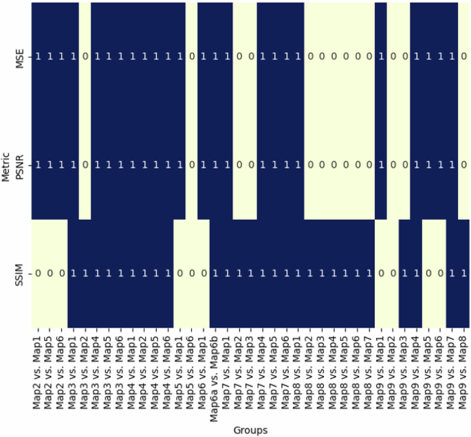
111 pairs were created and divided into general and special cases. 0 indicates that there were no significant differences between the groups, while 1 indicates that there were significant differences between the groups.

The trend indicates that most groups with significant differences in the PSNR metrics, fall in the area of 0.000 while the groups with significant differences in MSE and SSIM are dispersed and peak at 5000 U Stat with p-value approaches 1.
Quality improvement
To fix some problems in the graphical output that have been discussed in the previous section, some alternatives are possible to be implemented to improve the final results of the image translation between the cartographic archives and satellite images. Text removal and image segmentation are considered techniques to minimise errors during the reading process of the model. Several map samples, such as Map1 and Map6b are covered by many texts showing the toponyms, geographical objects, administrative boundaries, etc. Text removal aims to erase text and restore a proper background49. The main objective of this improvement is to prevent the leakage of the inappropriate pixel value from the texts that can distract the discriminator and generator model. The blurry pixels can also be diminished by image segmentation, for instance, Map2 and Map6 as shown in Fig. 9. This operation works to locate objects in the created boundaries by assigning every pixel that shares similar characteristics. Image segmentation gives better reproduction of visual patterns in the framework of map translation to satellite images50.

Text removal was successful in refining the final appearance of Map1 and Map6b. However, the image segmentation seemed to work significantly for Map2 only with detailed building footprints that rectify the graphic from historic maps into the segmented buildings, while in the case of Map6, the fixation was not much better.
Table 3 summarises the propensity of the model performance based on cartographic characteristics and the future improvement for the cartographic dataset. Our findings reported that some of the created cartographic archives earlier than the invention of satellite imagery gave a good-quality performance, for instance, Map2 and Map3, which were created in 1650 and 1714, while Map6, which was created later than these previous maps, gave a lower performance to the current satellite images. So, we are here not to give a conclusion by generalising the notion of mis-correspondence in the temporal stage and its effects on the generated images. Instead, an opposite trend may occur. Since we are limited to our dataset and pay more attention to the characteristics of the samples, a different trend may be found in other pieces of research in different contexts of place and time range.
Conclusion
The aspects of data migration and transformation are the prominent issues in strategies for long-term digital preservation, including cartographic archives that become the main focus of this research. Related to graphics processing software, good conversion and translation of cartographic heritage to satellite imagery is required to reduce the risk of loss and corruption of the data, including the colours, and other graphical properties. The historic map datasets from Java Island are selected in consideration of the diversity of cartographic characteristics as crucial attributes to the assessment. The performance of image reconstruction using GAN indicates that map styles, geographical depiction, scales, and creators are affecting the responses of the maps.
Overall, Map8 gives the best result of map translation, while Map4 is the worst. This is also related to the learning performance indicated by D Loss and G loss rates. The model runs the best on large-scale maps with smaller ratios with detailed objects such as buildings, road networks, etc. In contrast, the small-scale maps, which depict more comprehensive geographic information such as contours and coastlines give a low result. Differences in mapmakers also determine the results in which depicted geographical objects relate to the mapmaker’s perception, and the map with the best results is the map that depicts objects most similar to today’s modern satellites. Some refinement may be applied, such as text removal and image segmentation in the pre-processing stage to minimise the error during the translation process.


Responses